The Art of Color: Crafting Your Perfect Wedding Palette
Share

Choosing Colors for Your Wedding is Like Painting a Masterpiece
Whether you’re dreaming of a soft, romantic vibe or a bold, vibrant bash, your color choices matter. Let's dive into the world of wedding palettes and find out how to make an unforgettable color scheme for your big day.
"Colors, like features, follow the changes of the emotions." - Pablo Picasso
Understanding Color Psychology

Colors hit us differently. They affect our feelings and how we see things. Before you start picking swatches, you gotta know what different colors mean.
Warm Colors
- Red: Passion, love, excitement
- Orange: Energy, enthusiasm, warmth
- Yellow: Joy, happiness, optimism
Cool Colors
- Blue: Tranquility, trust, stability
- Green: Nature, growth, harmony
- Purple: Luxury, creativity, romance
When you understand these associations (it's super helpful), you can pick colors that match the vibe you want for your wedding.
Seasonal Considerations
The time of year has a big effect on which colors might work best.
Spring

Spring weddings often have fresh and light colors like:
- Soft pinks and peaches
- Light greens and yellows
- Lavender and periwinkle
Summer

Summer's bright & cheerful. Consider:
- Coral and turquoise
- Sunflower yellow and sky blue
- Fuchsia and lime green
Fall

- Deep burgundy and gold
- Forest green and burnt orange
- Plum and copper
Winter

Winter favors cool tones with sparkly touches:
- Navy and silver
- Emerald and ivory
- Burgundy and champagne
These are just ideas. Your wedding should mirror your personal style. No matter the season.
Creating Your Unique Palette
Now that we’ve covered the basics, let’s see how to make your unique wedding palette:
- Start with inspiration: Look around! Nature? Art? Fashion? Maybe your own home decor?
- Choose a base color: This is the main color in your palette. Be sure to choose a color you love.
- Add complementary colors: Pick 2–3 colors that go well with your base color.
- Include neutrals: Whites, creams, grays? These can balance everything out.
- Consider metallics: Gold and silver (or even copper!) can add some sparkle
Applying Your Palette

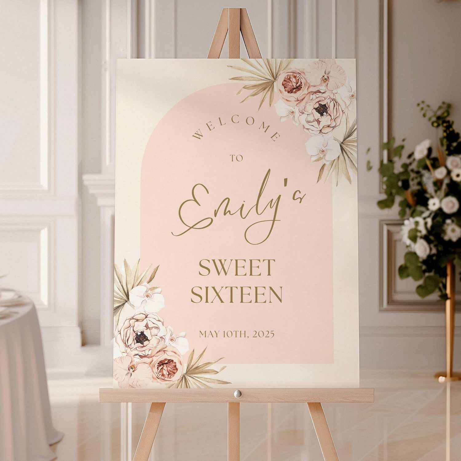
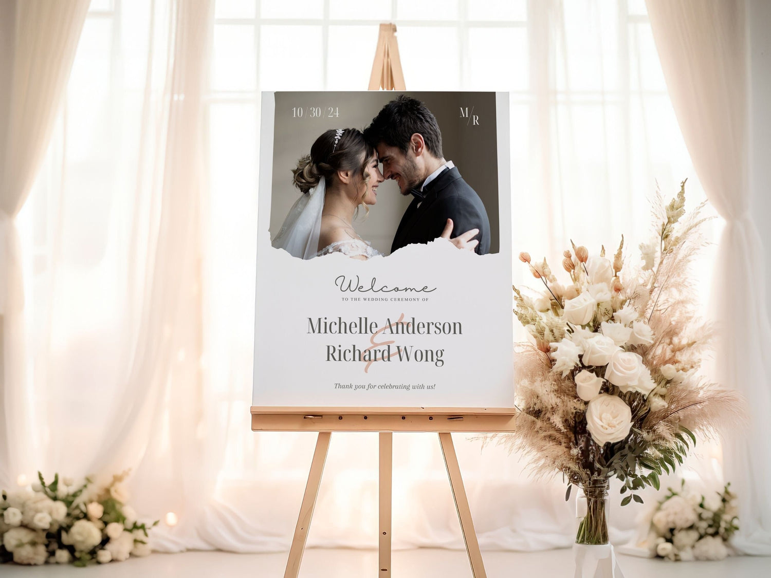
Vintage Floral Wedding Welcome Sign
After you've picked your colors? Time to bring them to life:
- Attire: Bridesmaids' dresses & groomsmen's accessories can showcase your colors.
- Flowers: Work with a florist to pick blooms matching your perfect palette.
- Decor: Think signage, table linens & centerpieces.
- Stationery: From invitations to place cards—let them all reflect your chosen hues.
- Lighting: Colored uplighting can change everything!
Avoiding Common Color Mistakes
Watch out for these common color palette pitfalls:
- Using too many colors: Stick to 3–5 max; otherwise things can start to look a bit chaotic.
- Ignoring your venue: Ensure your venue and its existing colors and decor match up with those fabulous colors you chose.
- Forgetting about contrast: Make sure important elements (like invitation text, seating charts, etc) are easy to read.
- Not considering photos: Some colors are tough to photograph well—talk to your photographer about it, so you both feel good about your color choices.

Choosing your wedding colors can be so fun! Understand color psychology & consider the season while following these tips—and you’ll design an eye-catching & meaningful event that reflects you—it's your day after all!


